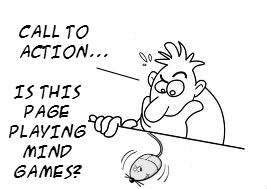
 Landing page optimization is all about convincing your reader to pay attention to you and understanding what they really want. What you present to them and how you present it is critical. Here are 18 sub-conscious triggers that will increase landing page conversions and turn website visitors into loyal fans of your business.
1. Choose one action
Have you ever seen a website that doesn’t give you any call-to-action? You land on their website, see a few products or services, and that’s about it? You’re usually inclined to leave, aren’t you? Likewise, websites with too many call-to-actions can confuse you. You become so overwhelmed with all the options that you click off the website entirely. To avoid confusion for your website visitor, choose one action and one action only. When a potential customer comes to your site, what do you want them to do? Focus on that one call-to-action on every page of your website.
2. Cut the jargon
The moment your customer sees a page of complex sentences with complicated words and company jargon, they’ll tune out before you get them past your first paragraph. Take a look at your website and see what you’re really saying to your website user. Evaluate every paragraph you’ve written. You know what you’re explaining, but would someone who has never heard of you or your business know what you’re talking about? Make every sentence simple and easy to understand.
3. Adding in the stats and studies
Your potential consumer will be enticed by your offer because of the benefits you show them. However, features help bolster the benefits and encourage them to give their email address over or hand over their hard-earned cash. Adding in case studies and statistics gives your potential customer more reasons to come to you.
4. Bullet points with bite
People read differently on the Internet. Study after study shows that website visitors barely read at all now. They skim the webpage and leave in a matter of seconds if they can’t understand how the website applies to them or if it’s too cluttered to figure out if it’s even relevant to them. That’s why it’s good to list bullet points that get straight to the point. List one-line bullet points and highlight the important words.
5. A button that speaks to you
When it comes to great call-to-actions, you must have a great button to go with it. People are more willing to click buttons that make them act quickly. Simply displaying the word, “Submit” will get less conversions than, “Get the secrets!” or “Get free e-book!”. Taking this to the next level have the button speak to what they really want. “Yes, I want to grow my business” or “I want beautiful teeth now!”.
6. Testimonials that convince your reader
People trust other people. You can list a hundred ways your company is great at what they do, and it won’t be enough to convince most consumers. Marketing well to your potential customer means taking people who are most like them and showing them how your product or service solved their problem.
7. Multiple call-to-action boxes
The more chances you give your potential customer to come in contact with your company the better. Say your website visitor is seeing your page for the first time. They see an opt-in box on the right side, but they’re not ready to hand over their beloved email address yet. They read your About Page, skim some of your blog posts and view a few of your testimonials. They’re slowly becoming convinced that maybe you could help them. That’s why it’s important to put in multiple call-to-action boxes as many places as you can without it looking too cluttered. If each call-to-action is different you are more likely to come across the right phrase that persuades them to take the next step.
8. Ask for email only
There’s a lot on the Internet to pull your website visitor away. After all, you are a new website and there are others they’re more familiar with. When creating a call-to-action, insert one field: an email address field. Leave out the name and last name fields. The less they have to fill out, the less risk they have, more likely they are to sign up for your email list. Later you can ask for more information.
9. Standout colors
According to studies that have tracked where a viewer’s eyes go when they’re presented with new information, going with a different color from the rest of your page can help with customer conversions. This is called the Vonrestorff effect and its benefits can align with great marketing tactics. To use this psychological trigger to your advantage, make your call-to-action box a different color that stands out from your marketing copy. Choose colors opposite each other on the color wheel.
10. As seen in…
Just like testimonials, people trust what other people say more than they trust you. Sure, they’ll get to know you over time and find out about your company for themselves. Still, consumers put their faith in groups of people who have garnered attention, trust and authority. Place the logos of organizations and businesses you’ve worked with on your website so your users can see them easily. Certifications work well too.
11. Let them know what they’re in for
Obviously, when you’re convincing someone to give his or her email address to you or buy a product from your business, you’re asking something of them. However, people can be weary of giving away their information or their money. Saying exactly what they’ll be getting when they enter their email address or hand over their credit card removes a psychological barrier between you and your customer. Let them know what they’ll be receiving and be specific.
12. Include what keeps your reader awake at night
Your reader has plenty of fears and frustrations. Some of them are different from others, but depending on what your website focuses on, you can tap into many of them. That means tapping into their psychology. Use the phrases and words that your customers use when they have a problem. Those words will be the ones that stick out at them the most.
13. Popup form
Website owners like to debate about the usage of pop-up forms on pages. For some, they think it’s annoying to their site users and they’ll never put one up. Others see the statistics (they increase subscriber rates dramatically), and put one up as soon as possible. As annoying as they are to some, they’re effective. You can choose to darken the screen so the focus is all on the web form, or not. As usual, it’s best to test it and evaluate the results on your own site.
14. Short and easy-to-read paragraphs
Conversion rate optimization increases by enticing a reader to read what you’re offering, how it will enhance their life and why they should hand over their information. The moment a new reader sees your site, the last thing they want to see is a long page with giant blocks of text. Make your paragraphs short and easy to read. No more than three or four sentences long.
15. Gift with purchase
Stores do it all the time. It’s normal to see phrases like “Free bag with purchase!” or “Buy two, get one free!” plastered all over the storefront. This is one way to get potential customers to act fast. The deal won’t last long, so they must make a move and buy now. Find a way to offer a free email series, e-book or video in exchange for their email address.
16. Toss out the rational words and inject emotional words instead
If you word your call-to-action with bland rational words, you won’t convert many people. Website visitors take action when you make them feel something. Talk about frustrations, worries, fears, desires and dreams. Include words in your call-to-action like, “find out,” “tell” and “happy” instead of rational words like, “learn,” “inform” and “pleased.”
17. For a limited time only
There’s nothing like a limit on your offer that induces a sense of urgency to your website user. Offering a product or service for a limited time only pushes your potential customer to act quickly because it may not be available next time they visit your website. Once way of doing this is having a countdown timer.
18. The first call-to-action shouldn’t involve a money exchange
There’s a journey that every one of your customers goes through. You lead a customer down a path the moment they come in contact with you. First they hear about you and opt-in to a free service. Later they become comfortable enough to buy a product or service from you, hopefully over and over again. Lastly, they move on to purchase more expensive products and services you offer. However, it all starts with one action. Make that action free so the journey begins easily for them.
Improving your conversion rate optimization is pivotal to your business if you want to gain more customers and clients. Implement these call-to-action optimization tactics into your web design and copy and get ready to take your business to the next level.
- The Rise of Intelligent Websites - February 19, 2025
- Top Trending Products to Boost Your Shopify Store in 2024 - September 4, 2024
- AI Terms Glossary: Key AI Concepts You Should Know - August 22, 2024

