The 2021 Conversion Rate Optimization Guide
Chapter 9
<<Previous | Table of Contents | Download the CRO Guide | Next >>
Copy simplified for ADHD
Now I know we are not all ADHD, but many of us have been affected by the speed of technology and we tend to have the attention span of a gnat. The point is this: Landing pages need to be designed for those of us who are multitasking and only spend approximately 3-5 seconds on a page. Information should be simple, broken into bit size chunks, using bullets instead of paragraphs.
When we first built QuoteCatcher®, a lead generation site, it had landing pages for each type of lead. On the side of the page, we had information about the service they were looking at in order to help them make an informed decision. It also had links to other associated services like list services on a telemarketing page. Later we removed that information from the landing page, put cross sell information on the thank you page, and the conversion rate when up. Now you could have an argument about the quality of the leads, but we let the call center filter those out. The important part is we spoke to more people, figured out what they wanted, and in doing so, we sold more leads.
When creating your landing page, you need to have only one purpose. Click the button! If you provide other links on the page, then you immediately decrease the odds of the user submitting. Now this is easy to say, but if you look at your page and count the number of links from the header, footer and copy, you may be surprised.
Tip: Do a heat map analysis of where users are clicking on your landing page. If you find that people are clicking other links, then perhaps you need to add more information on the landing page to answer their questions to keep them here. Landing pages are like an auto dealership car lot. Once the user leaves the page, the odds of closing are much lower.
Your copy must focus on only one action
As you write your copy from the subject line to sales objections, everything must focus toward submitting the form. The more questions you bring up, the more decisions they have to consider and the slower their decision process will become.
Make sure you do not create doubt. With doubt comes research, and at that point they just left your site.
If you sell a product that has multiple plans or product types, try to have the user make that decision after they have entered some contact information.
Tip: If you are using a multi-page funnel, use funnel metrics to determine which page users are leaving the funnel from and where they are going.
Action words and subject lines
The subject line of your landing page is the most important written content. Although it is only a few words, they are often the only words that keep the user on the page.
Tip: Look at your landing page for 2 seconds then look away. What do you remember? Ask your colleague to look at your new headlines for 2 seconds, which do they remember? Which do they feel perked their curiosity?
People are looking for three things when they land on your page. I am sure there are more but these are usually the core issues:
- Something that will reduce their risk.
- Something that will make their job easier.
- A quick way to learn something such as a list of top _____.
Reduce risk
This is the classic fear sales tactic. Create fear or doubt to make you understand the value in the product or service. Using negative words can instill fear and concern.
Make job easier
Provide information that will help make their job easier and make them look good. People want to learn. They are generally curious, but also lazy and feel like they do not have time. Providing lists of the top ____ or 3 reviews of ___ allow the reader to quickly understand something and walk away with a sound bit of information to share, or have a better understanding in a particular subject.
Tip: A/B test your pages with new subject lines. Sometimes the change of a couple words can make a significant impact on conversion rate.
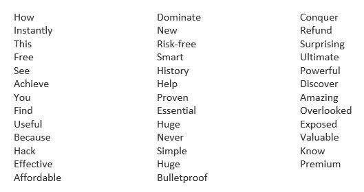
Try using these words the next time you create a subject line:
Fonts
There seems to be unlimited font types to test, and sometimes fonts are restricted by the graphic designer’s corporate identity that define the corporate brand. Fonts do have an effect on conversion rate, so you may have to use a font that is not part of the corporate identity on landing pages. Here are some guidelines:
- Sanserif fonts read easier and convert better than any other font.
- Pick a font size that makes it easy to skim on a desktop and mobile phone. Start testing with a minimum of 12 point, no smaller. Test mobile separately from desktop because you may use different font sizes per device.
- The background color and font color should not vibrate. Black background with white text is harder on the eyes, especially with a lot of content.
- Bolding text can work for a particular word. Be careful of bolding complete sentences too frequently.
<<Previous | Table of Contents | Download the CRO Guide | Next >>

- The Role of Chatbots in Enhancing Customer Experience: A Deep Dive - March 14, 2024
- Tackling Low Conversion Rates: A/B Testing Strategies Fueled by AI-Based Insights - March 14, 2024
- Why Support Bots Can’t Keep Up: The Case for E-commerce Specific Chatbots - February 28, 2024