Every business thrives on its brand visibility and the influx of customers, but more importantly, on the actions those customers take, making conversions the ultimate goal of any business.
It is necessary to stimulate viewers to take action and convert them from just website visitors to paying customers.
To induce the customer to take certain actions, there are specific metrics that can be followed to set things in motion. In this article, let us see some effective ways to craft click-worthy eCommerce call to action for your store.
What is Call-To-Action and Why is It Important for Your eCommerce Store?

Calls-to-Action (CTAs) are text or images placed on landing pages, product pages, and pretty much anywhere on the website that instigates the viewer to take a particular action. These actions can be as simple as making the viewer engage more with your page and navigate through them or even make them buy a certain product.
CTAs act as a type of persuasion to convince the customer to take an action that will be beneficial for the customer. These CTAs can vary greatly depending on the type of action, their placement on the website, and the forms they take (such as buttons, text, banners, hyperlinks, videos, images, pop-ups, or slide-ins).
As much as website design and product descriptions are important, ecommerce CTAs are also an important part of customer engagement. According to WordStream, the average conversion rate of a website or webpage is approximately 4.2% of the visitors. Placing CTAs in appropriate places can engage customers without sounding too pushy and help maintain long-term relationships with customers that align with business goals.
In an eCommerce store, CTAs convince the customers to take action by showcasing what might benefit them through engaging content, powerful words, and enticing phrases.
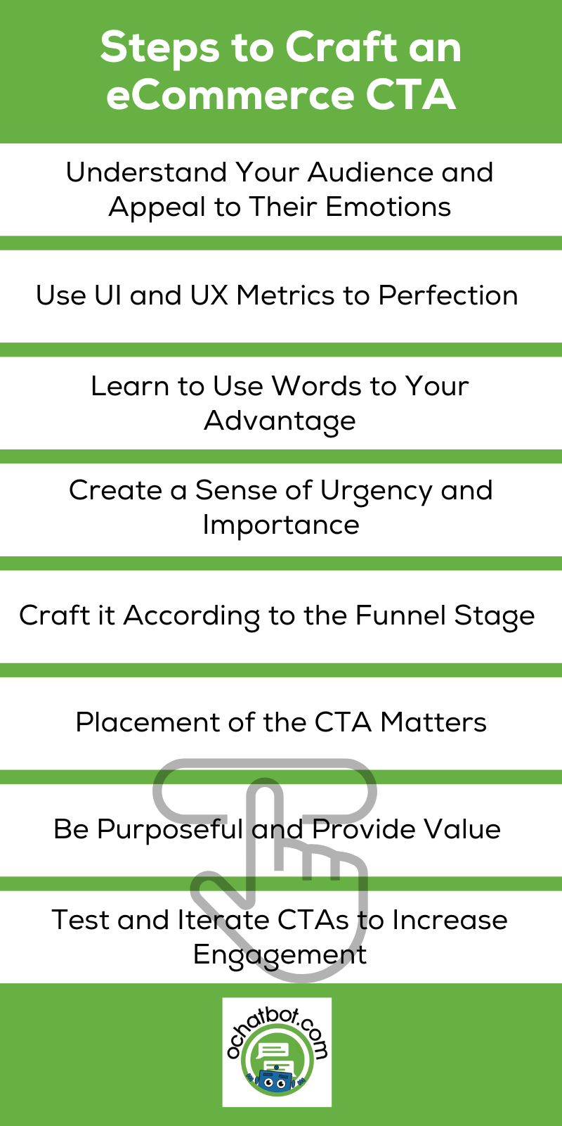
8 Steps to Craft an eCommerce CTA

There are no standard metrics or the right or wrong ways to craft your eCommerce CTA. All you have to do is make sure it serves its purpose by engaging the audience and inducing action. Let us now see some of the ways to help you design an effective ecommerce call to action.
Understand Your Audience and Appeal to Their Emotions
When it comes to inciting action, it is necessary to understand customers’ wants, needs, and expectations; and appealing to that is crucial when designing your eCommerce CTA.
Understanding your customer’s needs and preferences and personalizing your ecommerce CTAs to appeal to everyone generally gives an edge when crafting your CTA. Additionally, highlighting the benefits of the particular action and using proper persuasive action and power words can help curate CTAs that resonate with a viewer’s emotions and guide them to take action.
Use UI and UX Metrics to Perfection

As words can be powerful tools to engage the user, so are the design parameters. eCommerce CTAs that adhere to the UI and UX principles have a far better chance of being acted upon in comparison to bland, unengaging CTAs.
For example, you can change the color of the button from a subtle one to a vibrant one that makes it stand out and has a better chance of being acted upon. Additionally, changing the button or text size, altering the format, crafting its size, and placing the CTA in a position where the audience generally looks also increases the chances of taking action.
Read More: How to Design an Ideal Chatbot UX for Your Business? 10 Best Practices

True AI to engage customers for eCommerce, business leads, and customer support.
Create happy customers while growing your business!
-
5% to 35% Increase in AOV*
-
20% to 40% Increase in Revenue*
-
25% to 45% Reduction in Tickets with a Customer Service Chatbot
We Guarantee Results... Or Work For Free!
Learn to Use Words to Your Advantage
In addition to making the CTA attractive and vibrant with the UI elements, an effective CTA thrives on the proper usage of words.
Craft your CTA with concise wording that explicitly delivers the purpose of the action and a definite result. Usage of actions words and power words like, “Claim Now”, “Sign Up”, “Subscribe”, “Add to Cart”, “Buy Now”, “Contact Us” and other similar phrases can help captivate the audience by increasing their curiosity and triggering a response in them.
Create a Sense of Urgency and Importance

Most customers only take action in moments of urgency due to the fear of missing out, and this has proven to be an effective strategy.
Using terms of urgency and scarcity like “Limited”, “Don’t Miss Out” “Buy Now” and “Only xx Items Left”, and add elements like a timer, pop-ups, and slide-ins showing the number of products left in your CTA will trigger a psychological response in the viewers that can urge them to take the action. Additionally, showing early offers, referrals, and coupons within a time frame, and exclusive features to immediate responders can act as a friendly means of prompting the customers to act.
Ultimately, scarcity and urgency, along with a touch of motivation are powerful motivators that spur the user to take action.
Craft it According to the Funnel Stage

The sales funnel is a concept in marketing that describes a customer’s journey from a prospect to a customer through different stages. According to the funnel stage, there are various metrics used to appeal to the customers.
If the user is in the top stage of the funnel, you can add your CTAs to your landing page above the page fold, in newsletters, blogs, and social media. When the user is in the middle of the funnel, you can try adding your CTAs in emails and pop-ups, and towards the bottom of the funnel, CTAs can be ideally placed on product pages or checkout pages.
Here too, AI chatbots play a pivotal role in analyzing the stage of the funnel the customer is in and prompt the user to take action accordingly.
Placement of the CTA Matters
The place where a CTA is positioned directly influences the audience’s ability to land upon and click on it.
When crafting ecommerce CTAs, try placing the CTA above the page fold. A page fold is something a visitor sees when they first land on your page without scrolling. According to a stat by Nielsen Norman group, 84% of people treat the content above the page fold differently compared to the content below the page fold. So when placing a CTA, it can be beneficial to place it above the page fold for maximum engagement.
Using a lucrative ecommerce CTA right above the page fold can instantly engage the audience right when they land on your page. This can additionally be aided with the help of an engaging landing page, its content, and text.
Making sure the CTAs are easy-to-find and uniquely designed increases the chance of viewers seeing them and can encourage the viewer to take action. Additionally, adding multiple CTAs toward the end of the content and in between the page folds prompts the user to take action instantly, wherever the visitor is on the page.
Be Purposeful and Provide Value

Visitors will not only take action by lucrative or flashy CTAs that just grab the viewer’s attention. Instead, they look for value and purpose that is associated with your CTAs. Identifying the purpose of the customer and providing value accordingly can trigger positive action.
A customer visiting your ecommerce store to buy a product must be captivated by CTAs that feed the purpose of visiting your page. With the help of AI chatbots, it can be easy to drill down on what the user is looking for and guide them to satisfy their need. With the additional help of chatbots, you can know the channels through which customers arrive, the page they land on, and even gather insights from the customer contextually.
By focusing on building your brand, providing better products, and enhancing your customer service, you can help build purpose and provide better value to the customer and increase the weightage of your CTA.
Finally, Test and Iterate CTAs to Increase Engagement
CTAs are a sure way for businesses to ensure customer engagement and drive results. According to a study, about 70% of small businesses lack CTAs on their websites. Designing and implementing CTAs based on the above-mentioned factors can help increase the customer’s intent to take action.
As much as eCommerce CTAs drive the user to take action, precautions should be taken to avoid making CTAs too spammy or pushy. It is necessary to keep in mind that eCommerce CTAs should be designed to guide and assist the viewer make a decision not influence or force them.
Finally, making use of A/B testing and iterating your CTAs to test multiple formats can help narrow down on the perfect CTA which acquires better traction and attention.
Frequently Asked Questions
What are some examples of ecommerce CTAs?
Some examples of eCommerce CTA’s include: “Buy Now”, “Add to Cart”, “Subscribe”, “Join Us”, “Contact Us”, “Try for Free”, “Start Your Free Trial”, “Sign In”, and “Learn More”.
What is the most important thing when designing a CTA?
Keep in mind that to appeal to the audience’s emotions and understand their needs and preferences, make the CTA click-worthy visually and textually by using action and power words, presented aesthetically. Finally, keep experimenting, testing, and measuring the results to see the effects of your CTAs
What are some benefits of adding multiple eCommerce CTAs?
Adding multiple CTAs to your eCommerce store helps engage the user with a variety of options and helps make them take action whenever they feel like it. Also, it is necessary to make sure not too many CTAs are added that might feel spammy to the user.
- The Rise of Intelligent Websites - February 19, 2025
- Top Trending Products to Boost Your Shopify Store in 2024 - September 4, 2024
- AI Terms Glossary: Key AI Concepts You Should Know - August 22, 2024


