In this article, we’re going to show a quick summary of how we improved conversion rate for a leading e-commerce apparel retailer, by over 20% with a simple free shipping test. This is an extremely simple test, and easy to run on your own site.
Should you Test Shipping?
Before you invest the time and the effort to set up a shipping AB test on your website, you should first decide whether testing free shipping is worth it to your customers. Like most AB testing, this is nothing but common sense:
- Expected Lift per Sale: How much do you expect free shipping will lift your sales? Generally you should expect 25-40% improvements, depending on your industry and your vertical, because free shipping matters a lot.
- Impact on Margin: How much will paying for shipping eat into your profit margin? Usually shipping for apparel will run $5 – $10. At an AOV of $50 – $100, this is about 10% of your revenue, or maybe 20% of your net margin. This means that you’re going to need at least a 20% boost in sales to make up for the margin loss.
- Customer LTV: How much is each new customer worth to you? In apparel especially, there is value just from getting additional customers in the door, as getting your clothes onto more people will help the brand name spread. Furthermore, you should have metrics on how often new customers will buy from you again, and usually getting a new customer in the door is worth more than just one purchase.
For all the reasons above, I think it’s foolish NOT to run any shipping tests on your website, especially if you are doing significant volume ($100K+ in online sales). We achieved a 28% improvement for another client using similar techniques, and always recommend testing shipping for anyone that hasn’t tried it.
How We Approached It
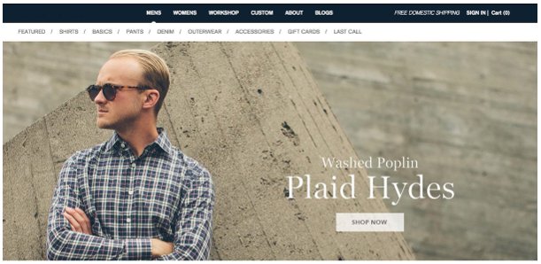
This client was already offering free shipping to all customers:
Looking at the site design, our team came up with a few hypothesis:
- The offer was valuable: Clearly offering free shipping to customers was an extremely strong offer. Compared to their competitors, this client was one of the few apparel retailers offering this.
- The offer was NOT prominent: Upon visiting the site, our eyes were drawn to the center design. The free shipping offer was nearly buried at the top right.
Our hypothesis, then, was that simply drawing more attention to the offer would make people aware of it, and the strength of the offer would convert more customers into buyers.
The Test, and Results
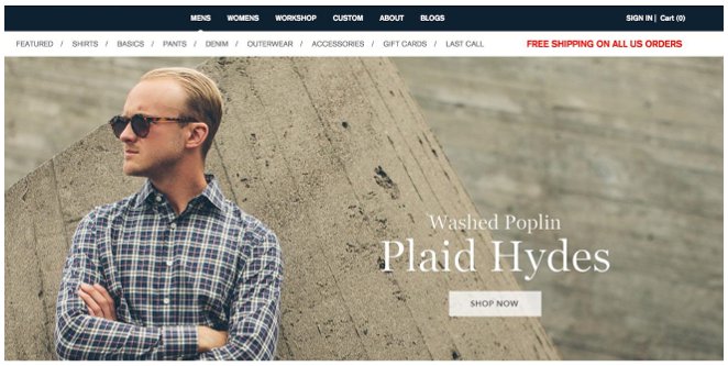
Here is the test variation we developed:
We’ve found with prior tests that bright red really does the trick when drawing attention to an offer. Over a 2 week test, the results were:
- 20% Improvement in Conversion: At 94-95% confidence level.
- No Change in AOV: Surprisingly, the AOV did NOT change when we advertised free shipping. Because the client sells high end apparel, there were few ways that customers could “cheat” the system by purchasing low price products while still getting shipping paid for.
For a large and established e-commerce retailer such as this – this is huge! Getting a 20% gain from such a small change in the website is a big deal, and means that there is more potential to be had with additional testing.
How You Can Do This
For your own ecommerce site, I’d first recommend “running the numbers” to see whether offering shipping is cost-effective for you. Then, try queuing up a few of your own tests to get some quick data before going too in depth.
Guest Author: Andy Hunt is the head geek of CRO at Uplift, a pay on performance CRO service. He’s been in the internet marketing industry for 6 years and previously worked as a marketing manager at Google and account manager at Facebook. You can follow him online at @tnuhandy.
- The Rise of Intelligent Websites - February 19, 2025
- Top Trending Products to Boost Your Shopify Store in 2024 - September 4, 2024
- AI Terms Glossary: Key AI Concepts You Should Know - August 22, 2024


