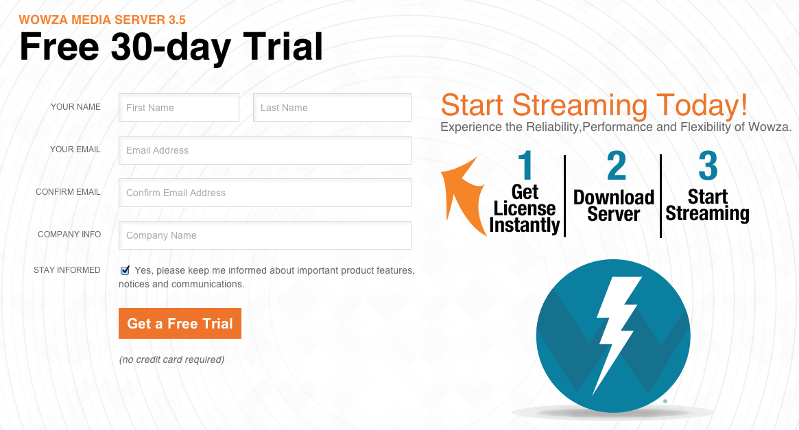
10% More Conversions
We have all seen forms on the right, left, top, bottom and wondered which is better. In this A/B test when the from was placed on the right there was a 10% increase in conversions. When you have little text and images this format converts better.
In formats with long sections of text ironically often having the form on the bottom below the fold with call-to action buttons interspersed works well. This has to do with the slow process of convincing the user and pitching them over coming one obstacle at a time.
Latest posts by Greg Ahern (see all)
- The Rise of Intelligent Websites - February 19, 2025
- Top Trending Products to Boost Your Shopify Store in 2024 - September 4, 2024
- AI Terms Glossary: Key AI Concepts You Should Know - August 22, 2024


